The trip we’re on now will be an epic vacation to remember, of that there is no doubt.
The boys are 7 and 10 — old enough to behave themselves (this is a relative concept, of course) and mature enough to appreciate activities beyond the playground. So, when Michael’s middle elder brother and his family suggested meeting in Florida (we are 10 in all, with 6 coming from Scotland and 4 from Texas), we began to prepare to explore Disney World and beyond.
The trip has been years in the planning — long enough that it was hard to believe the time had finally arrived — and so far it’s been all that we imagined and looked forward to.
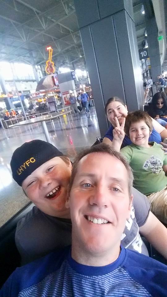
At the airport, heading out 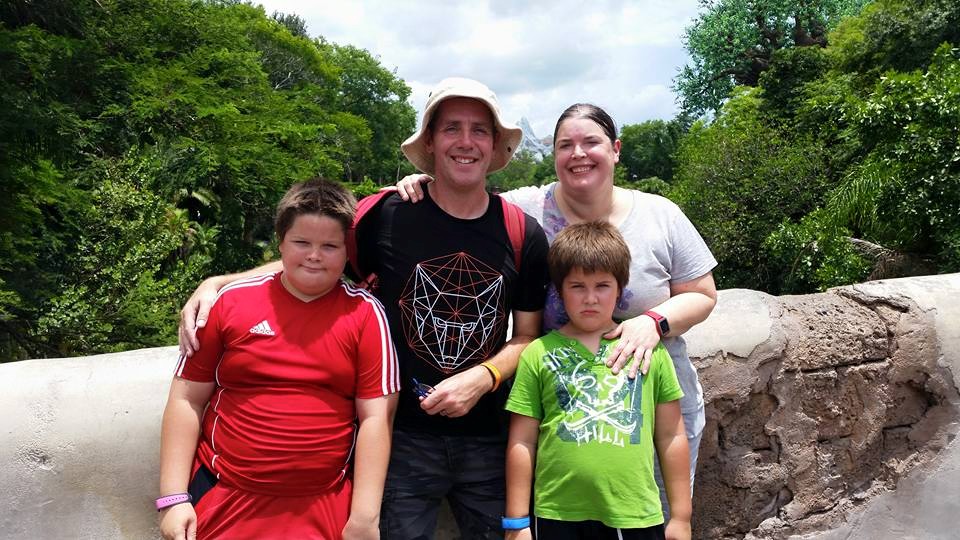
Animal Kingdom 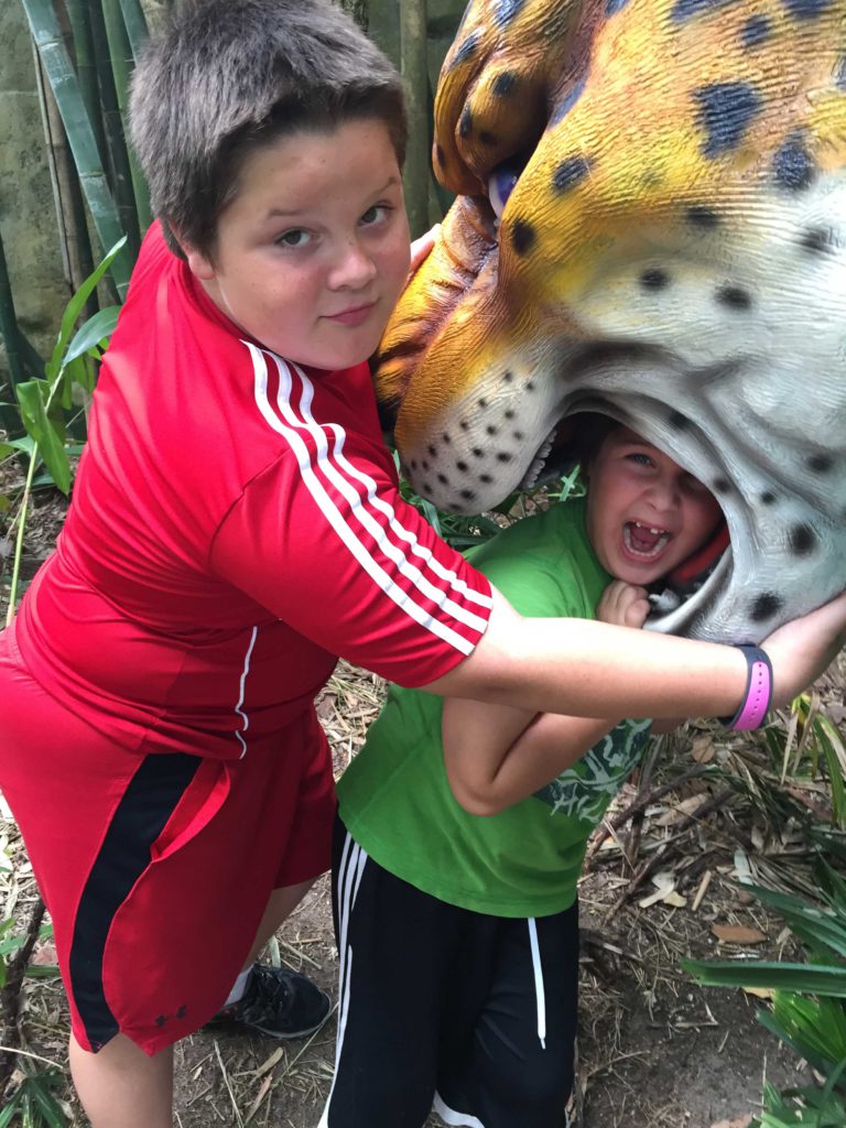
What the boys did to one another the whole vacation 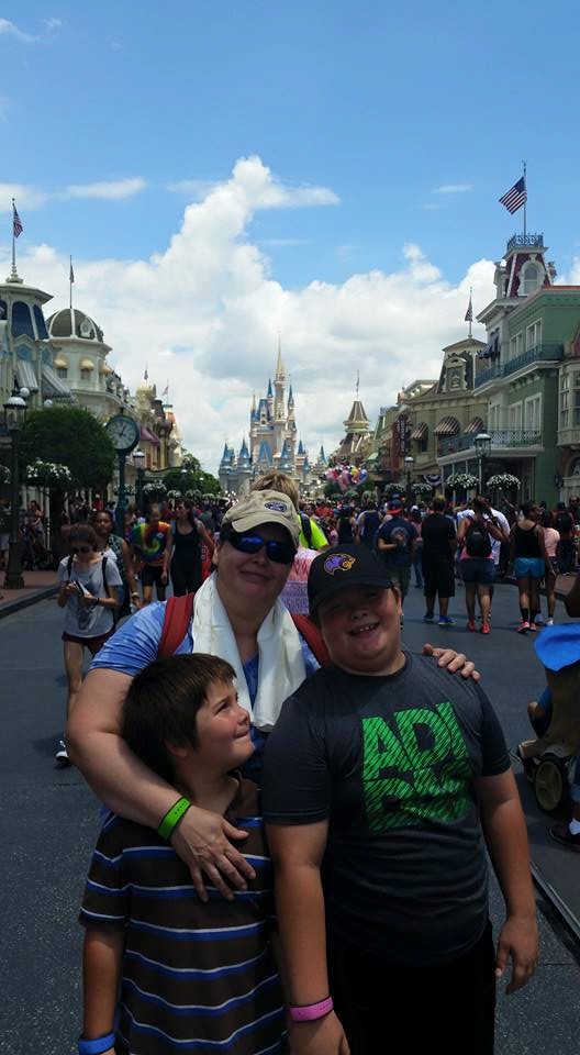
The Magic Kingdom 
“Bob” 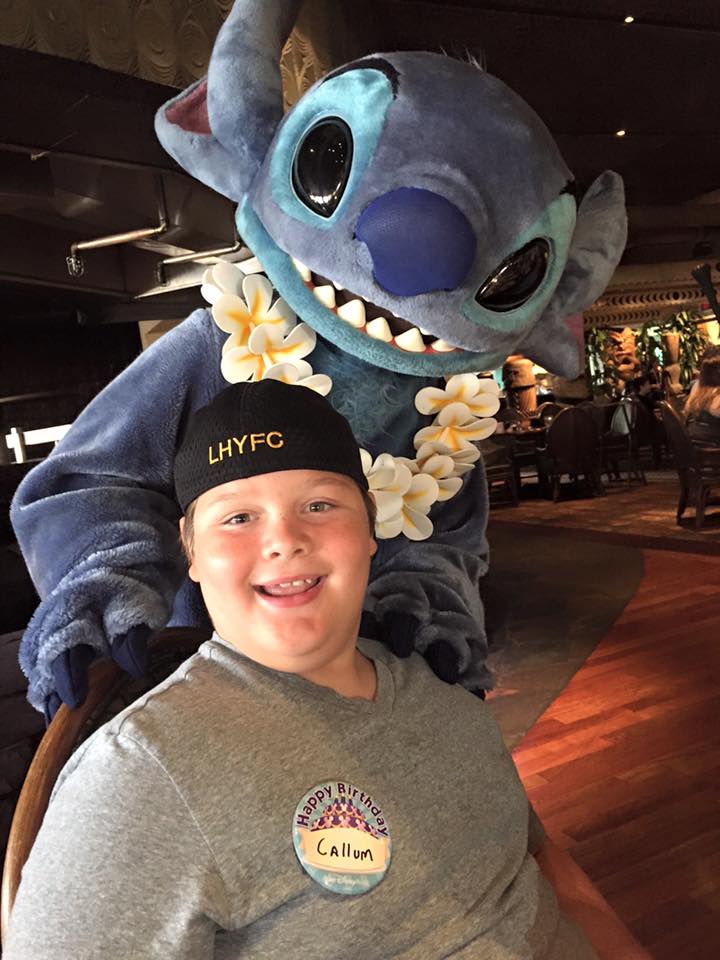
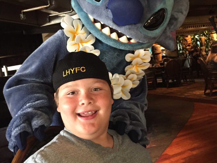
Birthday Breakfast with Stitch! 
Dolphin 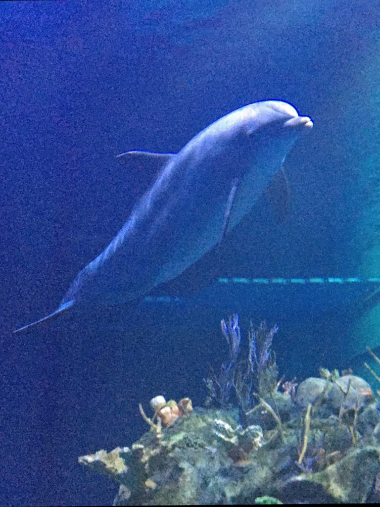
Dolphin 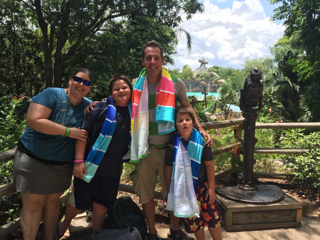
Typhoon Lagoon 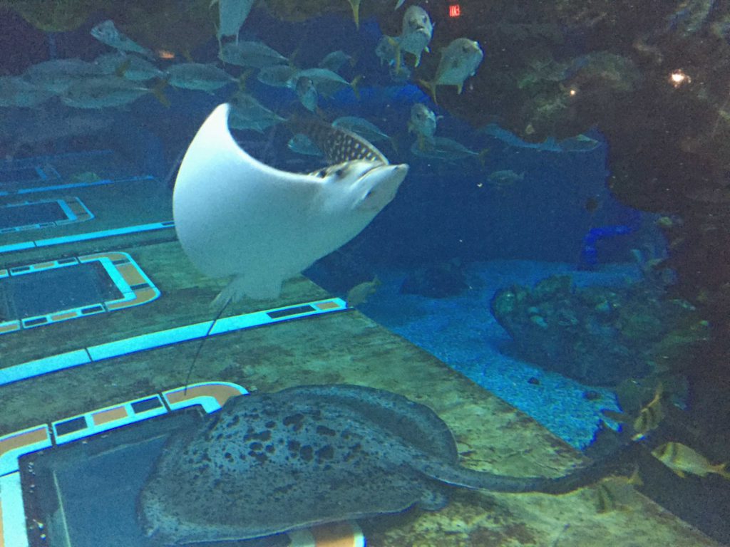
Rays 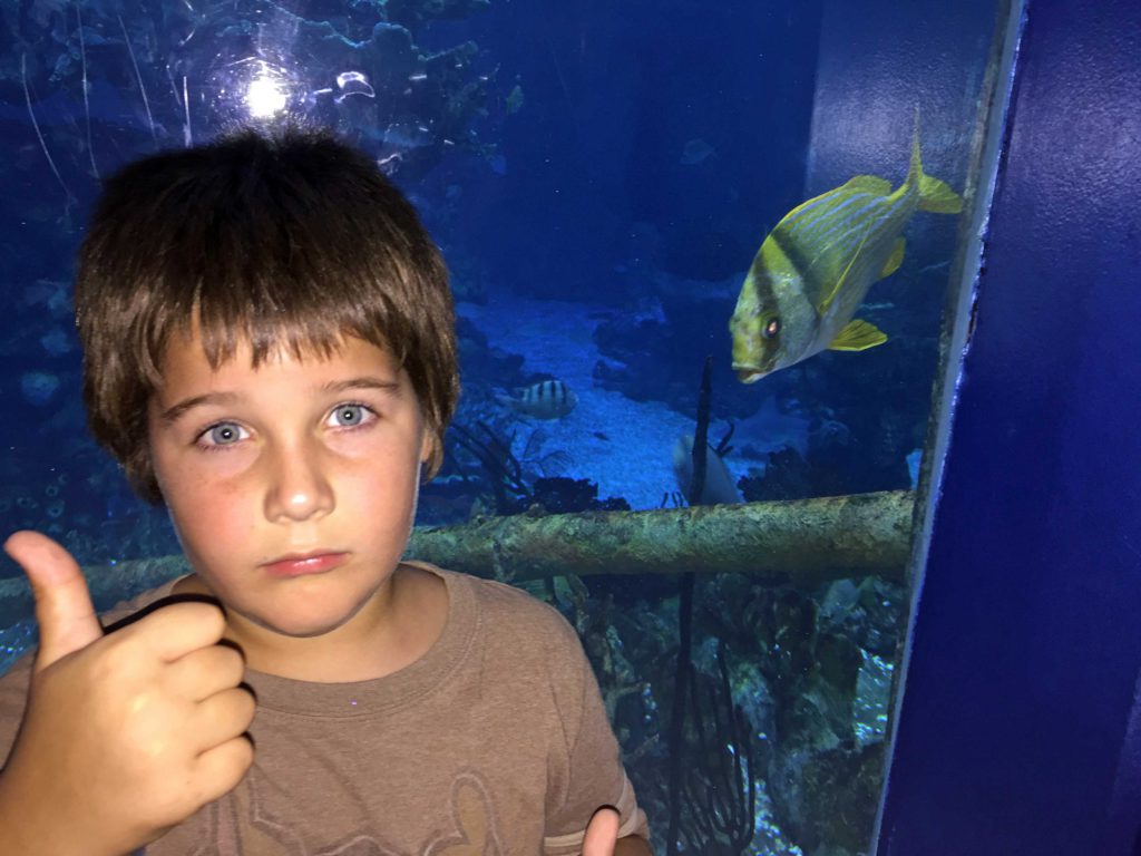
This fish was really interested in Rory 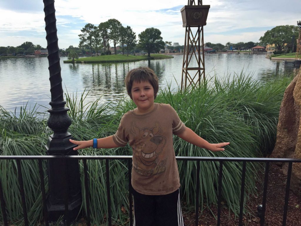
Epcot
In this post, I’ll focus on week 1, which has just concluded, where we immersed ourselves in all things Disney.
First some thoughts on Disney. It’s easy to see why people go nuts about Disney World, even though I’m skeptical about merchandising and commercialism and the glorification of shopping — and that’s definitely a big part of it, as you can see when you’re exiting a ride and are channeled directly into a gift shop. But I have to admit that Disney works very hard to create an amazing customer experience. (Hence the “weird rules” you see written about now and then.)
In my job writing about digital marketing, we constantly talk about the customer experience and the importance of giving customers an immersive, consistent experience regardless of how, or on what platform, they are encountering the brand. I’ve seen no more salient example of the success of this approach than my experience this past week.
For the most part, we found the physical surroundings very pleasant and clean at all of the parks, and the folks we dealt with were very friendly and helpful. The performances and rides we found dazzling in some cases and enjoyable in others. Rarely were we disappointed. Even a “cast member” we encountered in a Target parking lot was all smiles and magic, extolling the virtues of Disney and her job.

It’s not even that things are perfect at Disney — I saw rides out of order, bathroom stalls out of service and seats on rides blocked off because they weren’t functioning. But the way they handle things is just right. When things go wrong, the employees steer guests into equally appealing alternatives. It’s like the classic social media situation where businesses are encouraged to be open, transparent and honest about what went wrong — then make it right.
It’s no small feat keeping 53K people a day happy (that’s the average daily attendance of the Magic Kingdom), and I think the innovations with the most profound effects are likely things that park-goers don’t even consciously notice.
It’s The Little Things
I’ve read in a few places that the buildings along Main Street USA are designed so that the second and third stories are not full size — it’s an optical illusion technique called “forced perspective” — which actually makes the buildings look taller than they are. Same thing for Cinderella’s castle — it’s designed in such a way (and the buildings along Main Street add to this) to look taller and more impressive than it actually is. This may not be something that visitors notice but I’m sure it affects their perceptions of their experience.
Other details I found especially interesting (note that these are items I’ve read but haven’t verified):
- As visitors enter the Magic Kingdom, they walk on red bricks, meant to simulate the feeling of walking on a red carpet.
- Apparently, garbage cans are located no more than 30 paces apart throughout the park. One source says Walt looked at visitor behavior in other parks and found that people would hold only onto trash for that long before dropping it. So, the design encourages visitors to throw away their own trash, resulting in a cleaner and more pleasant experience for everyone.
- One observer wrote that each of the buildings along Main Street have American flags hanging in front of them — not because just because of the patriotic experience, but because they are lightning rods. I noticed the prevalence of lightning rods in the water parks, as well, as every structure taller than a person boasted a lightning rod or two. Since we’ve been in Florida, it’s rained pretty much every day, making the presence of lightning rods a very thoughtful addition.
- Another noted that the surfaces of the walking paths change as you walk through the different “lands” of the park — possibly subtle, but noted.
One academic, Karal Ann Marling, refers to it as the “architecture of reassurance,” the way everything is designed to be pleasant and non-threatening.
Accessibility Vs. Walkability
Though the parks are models of accessibility (and communication about accessibility) in some ways, they’re remarkably exclusive in others. Many of the attractions, especially in the water parks, required serious stair climbs and long periods on your feet.
I’m not saying there’s anything wrong with this — in fact, I’m sure going to Disney World is one of the most active experiences that a lot of American families have annually (and that’s a good thing). But I found it interesting the way the parks straddled these two ideals — of accessibility and of fitness and walkability.
In a film laying out Walt Disney’s vision for Disney World (which wasn’t opened until after his death), a narrator explains the walkability ideal: “Here the pedestrian will be king, free to walk and browse without fear of motorized vehicles.”
Here are my Up records of the steps taken on each day in the parks (we didn’t go nuts and weren’t at any park from dawn until dusk):
- Fri (Animal Kingdom) 17K
- Sat (Magic Kingdom) 13K
- Sun (Typhoon Lagoon) 15K
- Mon (Magic Kingdom) 12k
- Tues (Blizzard Beach) 11K
- Wed (Epcot) 13K
Interestingly, though my step tracker kept me appraised of our progress, it didn’t feel like anything was very far away from anything else in any of the parks. When we set off from one attraction to another, we got there relatively quickly and mostly without getting lost.
Patronage
Another undeniable positive aspect of the Disney phenomenon is the opportunity for artists and performers to make a living doing their thing. Aside from New York City, it’s hard to imagine a greater concentration of dancers, singers, acrobats (not to mention choreographers and costume designers).
I don’t know what their wages are like or whether they’re worked to the bone, but it seemed to me a very good thing — perhaps even cultivating park-goers tastes so they’re more inclined to support the arts in their own hometowns upon their return.
Urban Living/Planning
In doing the research inspired by our trip to the parks, I learned that Disney World, and Epcot in particular (it stands for Experimental Prototype Community Of Tomorrow), was originally meant to be a place for people to actually live. When you think about the parks through that lens, they are especially interesting.
I’ve learned that Walt Disney created Disneyland to give children a safe, wholesome place to go with their families. The traveling carnivals and such of the time were a little seedy. Apparently, he also thought the inner city/suburb divide developing at this time was also eroding some of the positive aspects of American life, so he put his head to designing a “community of tomorrow.”
These ideas aren’t foreign to me, of course. Having lived in suburbs, cities and now, in a relatively small town, I’ve seen the pros and cons of each option. Ideally, I’d combine the “safety” and ease of living in the suburbs or a small town with the walkability of living in a city. But is Disney-style architecture the answer? If anything, it glosses over the complexities. I was simultaneously reassured and disturbed by it, especially the underlying truth that this pleasant and reassuring atmosphere was only available to those who could pay $100/day for admission.
Jennifer Gray, a historian of modern art and architecture, gave a talk at MOMA on the topic and was later interviewed by ZDNet’s Sonya James. In the writeup, Gray said of Main Street: “its miniaturized scale, historical details, and clearly nostalgic design reduce the undisciplined complexities of a city to the status of a toy – believable, fun, and entirely controlled and harmless.”
Which explains why it’s such a draw and can be so pleasant to immerse yourself in Disney’s World for a short time.
The Future Of Yesterday
One of the creepiest aspects of Epcot, I found, is its utopian view of “tomorrow” — especially given that we’re now actually living in the tomorrow that was envisioned when the park was built in 1982 (and laid out by Walt Disney even before he passed away in 1966).
While I agree there are problems that need to be solved, I’m troubled by the Big Brother aspect of “we know best” and the seemingly blind trust in corporations. And isolating people completely from a natural world by putting them under a dome? It just seems wrong.
Talk of the natural world seems a good segue into Week 2 of our vacation, spent by the Florida Gulf Coast. I’ll post that bit when it’s ready.
P.S. I posted one of our first GoPro videos of the Teamboat Springs ride in Blizzard Beach.